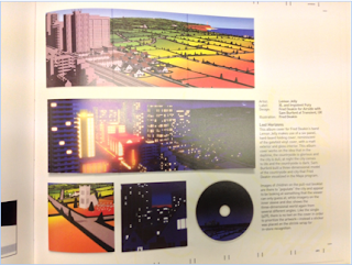
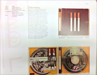
I Like the creative style of the digipak and how its cut out and uses unique shapes and colours.
I love how they have made their digipak into a book and that they can read through the images and text.
I Like the simplistic shapes and the numbers of the tracks on the CD.
The album cover is made to look like a pocket from some genes or polo shirt which creates a unique effect
I Like how this divi pack is made from wood and it resembles a drawer when you pull the CD out of its case.
The fact that this CD case looks like and envelope is very creative and unique and will attract attention because its so different.
I like how this opens and the way that it holds all the content inside and i also like colours they use.
The velcrow on the corners of this album is different to most but a good idea to stop the album cover from opening so easily.
This casing for the the CD is amazing because of the different material it uses to incase the CD as well as the caseing allowing you to see the CD art etc.
I like how the digipak comes in an house made from card with a booklet full of pictures and that the casing has an image that you can see the CD through.
YOu can hang this casing on a peg etc which is creative and allows you to hang it where you can see the art on the casing.
On this digipak they have made it stand up so that you can look at the art as well as get your CD out easier


No comments:
Post a Comment